Skilfut
Modern React UI components for seamless integration
What is Skilfut? Complete Overview
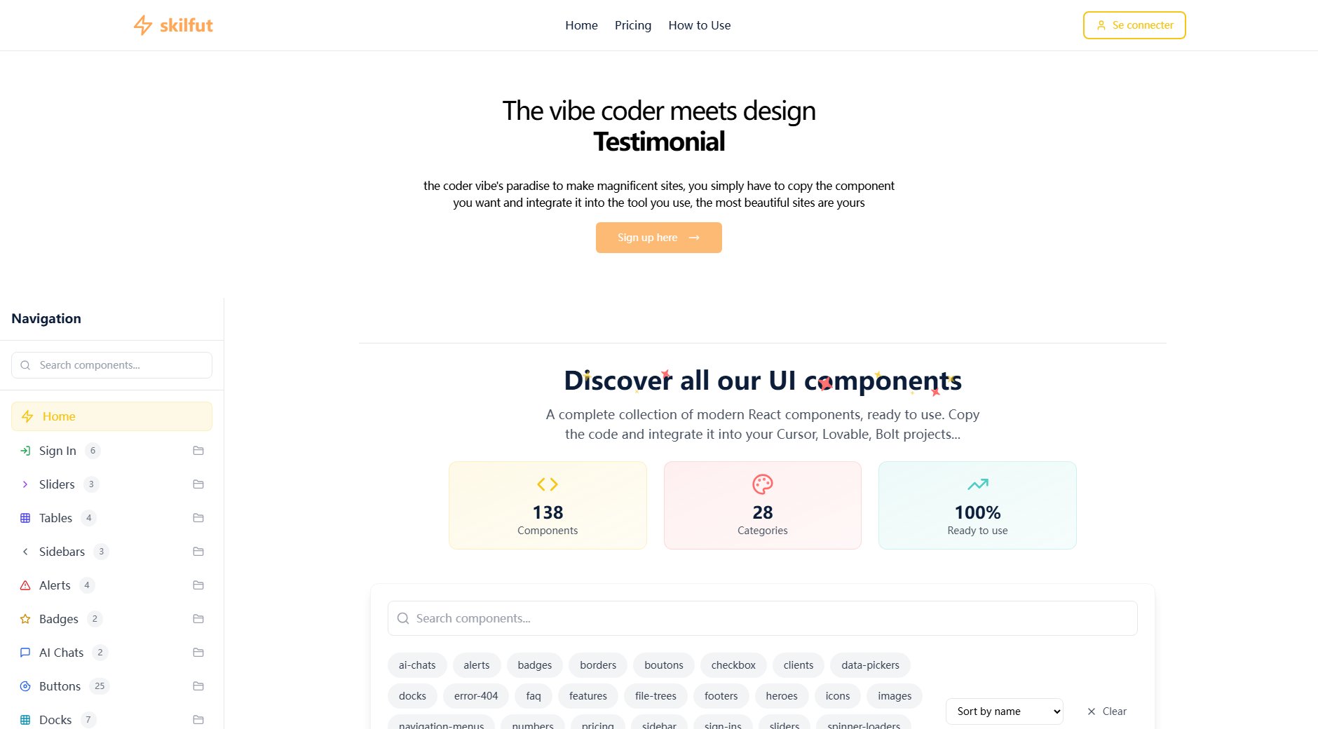
Skilfut is a comprehensive collection of modern React components designed to accelerate your development workflow. With 138 ready-to-use components across 28 categories, developers can quickly integrate beautiful, functional UI elements into their projects. Each component is built with TypeScript and comes with interactive demos, clean code examples, and detailed documentation. The library solves key pain points for developers by providing production-ready components that handle complex functionality like animations, state management, and accessibility out-of-the-box. Target users include frontend developers, UI engineers, and product teams working with React who want to build polished interfaces without reinventing common UI patterns. Skilfut stands out with its focus on animated, interactive components that bring interfaces to life while maintaining excellent performance.
Skilfut Interface & Screenshots

Skilfut Official screenshot of the tool interface
What Can Skilfut Do? Key Features
Animated UI Components
Skilfut specializes in components with sophisticated animations powered by Framer Motion and GSAP. From 3D buttons with hover effects to loading spinners with game-inspired animations, these components add polish and delight to user interfaces. The animations are performance-optimized and work seamlessly across devices.
Production-Ready Code
Every component comes with clean, well-structured TypeScript code that follows React best practices. The code includes proper typing, accessibility attributes, and responsive design considerations. Developers can copy-paste components directly into their projects or use them as inspiration for custom implementations.
Comprehensive Documentation
Each component features live demos, code examples, and detailed usage instructions. The documentation covers props, customization options, and implementation tips. This makes it easy to understand how to adapt components to your specific needs without digging through source code.
Design System Consistency
Components follow consistent design principles with customizable themes. Color schemes, spacing, typography, and interaction patterns are harmonized across the entire library, making it easy to build cohesive interfaces. Dark/light mode support is included out of the box for many components.
Interactive Previews
The component showcase allows you to interact with live examples before implementing them. See animations in action, test responsive behavior, and experiment with different variants - all directly in your browser. This helps you evaluate components before committing to integration.
Best Skilfut Use Cases & Applications
Rapid Prototyping
Product teams can use Skilfut components to build interactive prototypes in hours instead of days. The pre-built UI elements allow designers and developers to focus on user flows and functionality rather than rebuilding common interface patterns from scratch.
SaaS Dashboard Development
Developers building analytics dashboards or admin panels can leverage Skilfut's advanced data visualization components like tables with sorting/filtering, charts, and metric displays. These save weeks of development time while delivering polished, professional interfaces.
Marketing Site Creation
The library's animated hero sections, testimonial sliders, and pricing components help marketers create engaging landing pages that convert. Eye-catching animations and interactions can be added without custom development work.
Design System Foundation
Teams establishing their design system can use Skilfut components as a starting point, customizing them to match brand guidelines. This accelerates design system development while ensuring accessibility and responsiveness are handled properly.
How to Use Skilfut: Step-by-Step Guide
Browse the component library by category or search for specific UI needs. The organized showcase lets you quickly find buttons, forms, navigation elements, and other common patterns. Each component card shows a preview and key details at a glance.
Click on any component to view its interactive demo and documentation. Test different states and variants directly in the browser. The live preview helps you verify the component meets your requirements before implementation.
Copy the component code to your clipboard with one click. The code snippet includes all necessary imports, TypeScript types, and basic implementation. For complex components, the documentation provides additional usage examples and configuration options.
Paste the component into your React project and customize as needed. Most components accept props to modify their appearance and behavior. The consistent design system makes it easy to style components to match your brand.
Integrate the component with your application logic. Connect buttons to actions, forms to submission handlers, and data components to your backend APIs. The components are designed to work seamlessly within larger applications.
Skilfut Pros and Cons: Honest Review
Pros
Considerations
Is Skilfut Worth It? FAQ & Reviews
Components are built with React, TypeScript, and popular animation libraries like Framer Motion. They're designed to work with modern React ecosystems including Next.js and Vite.
Yes, all components can be used in personal and commercial projects. The free tier has some limitations, while the premium plan offers complete freedom for commercial use.
New components are added regularly based on community feedback and emerging UI trends. Premium subscribers get immediate access to all new additions.
Yes, accessibility is a priority. Components include proper ARIA attributes, keyboard navigation, and screen reader support where applicable.
Absolutely! The team welcomes component requests from the community. Popular requests often get prioritized for development.