Dotti
Retro-futuristic React UI library with 30+ components
What is Dotti? Complete Overview
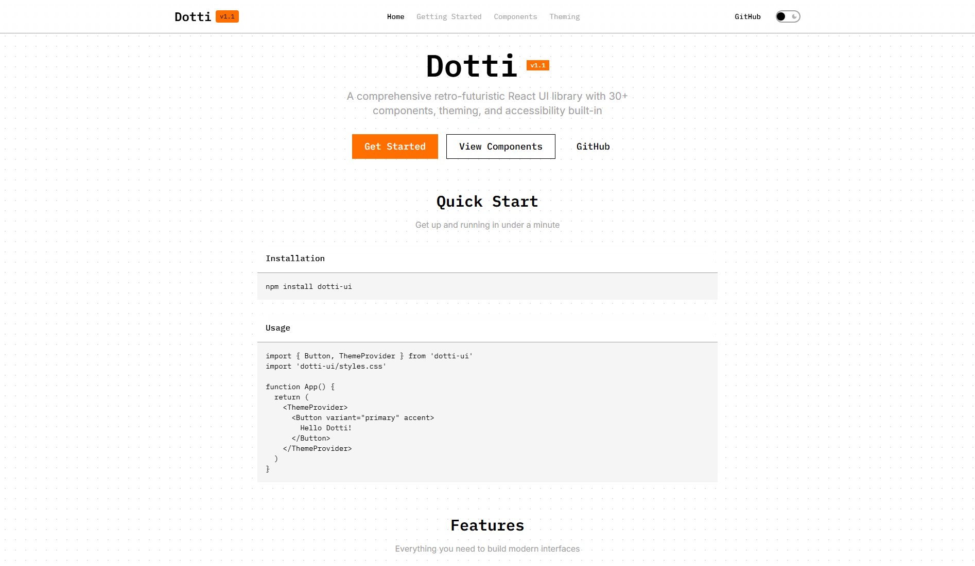
Dotti is a comprehensive retro-futuristic React UI library designed to help developers build modern interfaces with ease. It offers a collection of 30+ accessible and customizable components, built-in theming with dark mode support, and a focus on minimalist, functional design. The library is fully typed with TypeScript and optimized for tree shaking to ensure optimal bundle sizes. Dotti's design philosophy is inspired by Teenage Engineering's minimalist hardware and Nothing OS's clean software aesthetic, featuring 90% monochrome with strategic accent colors. This makes it ideal for developers looking to create interfaces that are both visually striking and highly functional.
Dotti Interface & Screenshots

Dotti Official screenshot of the tool interface
What Can Dotti Do? Key Features
30+ Components
Dotti provides a comprehensive set of over 30 accessible and customizable React components, including buttons, forms, navigation elements, and more. Each component is designed with retro-futuristic aesthetics while maintaining full functionality and customization options.
Theme System
The library includes a built-in theme system with dark mode support and customizable theming options. Developers can easily adjust colors, typography, and other design tokens to match their project's branding while maintaining the distinctive Dotti aesthetic.
TypeScript First
Dotti is built with TypeScript from the ground up, offering excellent type definitions and developer experience. This ensures type safety, better code completion, and fewer runtime errors in your React applications.
Tree Shakeable
The library is optimized for modern bundlers, allowing you to import only the components you need. This results in smaller bundle sizes and better performance for your applications.
Accessible
All components are ARIA compliant and support keyboard navigation, ensuring your applications are usable by everyone. Dotti follows WCAG guidelines to provide an inclusive user experience.
Retro-Futuristic Design
Inspired by Teenage Engineering and Nothing OS, Dotti combines minimalist design with futuristic elements. The 90% monochrome palette with strategic accent colors creates interfaces with maximum visual impact while maintaining clarity and functionality.
Best Dotti Use Cases & Applications
Modern Web Applications
Dotti is perfect for building modern web applications that require a distinctive visual style without sacrificing functionality. Its comprehensive component set covers most UI needs, from forms to navigation.
Developer Tools & Dashboards
The library's minimalist design and strategic use of accent colors make it ideal for developer tools and dashboards where clarity and functionality are paramount.
Product Landing Pages
Dotti's striking retro-futuristic aesthetic can help product landing pages stand out while maintaining a professional, polished appearance.
Progressive Web Apps
With its tree-shaking capabilities and optimized performance, Dotti is well-suited for progressive web apps that need to load quickly and work offline.
How to Use Dotti: Step-by-Step Guide
Install Dotti using npm or yarn by running 'npm install dotti-ui' in your project directory. This will add the library and its dependencies to your project.
Import the necessary components and styles in your React application. For example: 'import { Button, ThemeProvider } from 'dotti-ui' and 'import 'dotti-ui/styles.css''.
Wrap your application or component tree with the ThemeProvider to enable theming and dark mode support throughout your app.
Use Dotti components in your JSX code. For example: '<Button variant="primary" accent>Hello Dotti!</Button>'. Customize components using the available props and variants.
Build and run your application as usual. Dotti components will render with their distinctive retro-futuristic style while maintaining all the functionality you expect from React components.
Dotti Pros and Cons: Honest Review
Pros
Considerations
Is Dotti Worth It? FAQ & Reviews
Yes, Dotti works perfectly with Next.js and other modern React frameworks. You can use it in both client-side and server-side rendered applications.
Absolutely. While Dotti comes with a distinctive retro-futuristic color scheme by default, the theme system allows you to customize colors, typography, and other design tokens to match your brand.
Yes, Dotti components are designed to work with server-side rendering. The library includes solutions for handling styles during SSR to prevent flickering.
The library is actively maintained with regular updates that include new components, bug fixes, and performance improvements. Check the GitHub repository for the latest release information.
Currently, Dotti is maintained as an open-source project with community support. For commercial support inquiries, you can reach out through the GitHub repository.