Komorebi Color Play
Japanese-inspired color palette generator for designers & artists
What is Komorebi Color Play? Complete Overview
Komorebi Color Play is a sophisticated color palette generator that draws inspiration from Japanese aesthetics to help designers, artists, and developers create harmonious color schemes. The tool provides comprehensive color information across multiple industry standards (PANTONE, RAL, NCS), digital formats (HEX, RGB, HSL), and artistic systems (COPIC, Prismacolor). It solves the pain points of color matching across different mediums and ensures accessibility compliance with WCAG ratings. The target audience includes graphic designers, web developers, product designers, and artists who need precise color coordination for their projects. With features like palette building, image extraction, and detailed color science data, Komorebi serves as a versatile tool for professional color work.
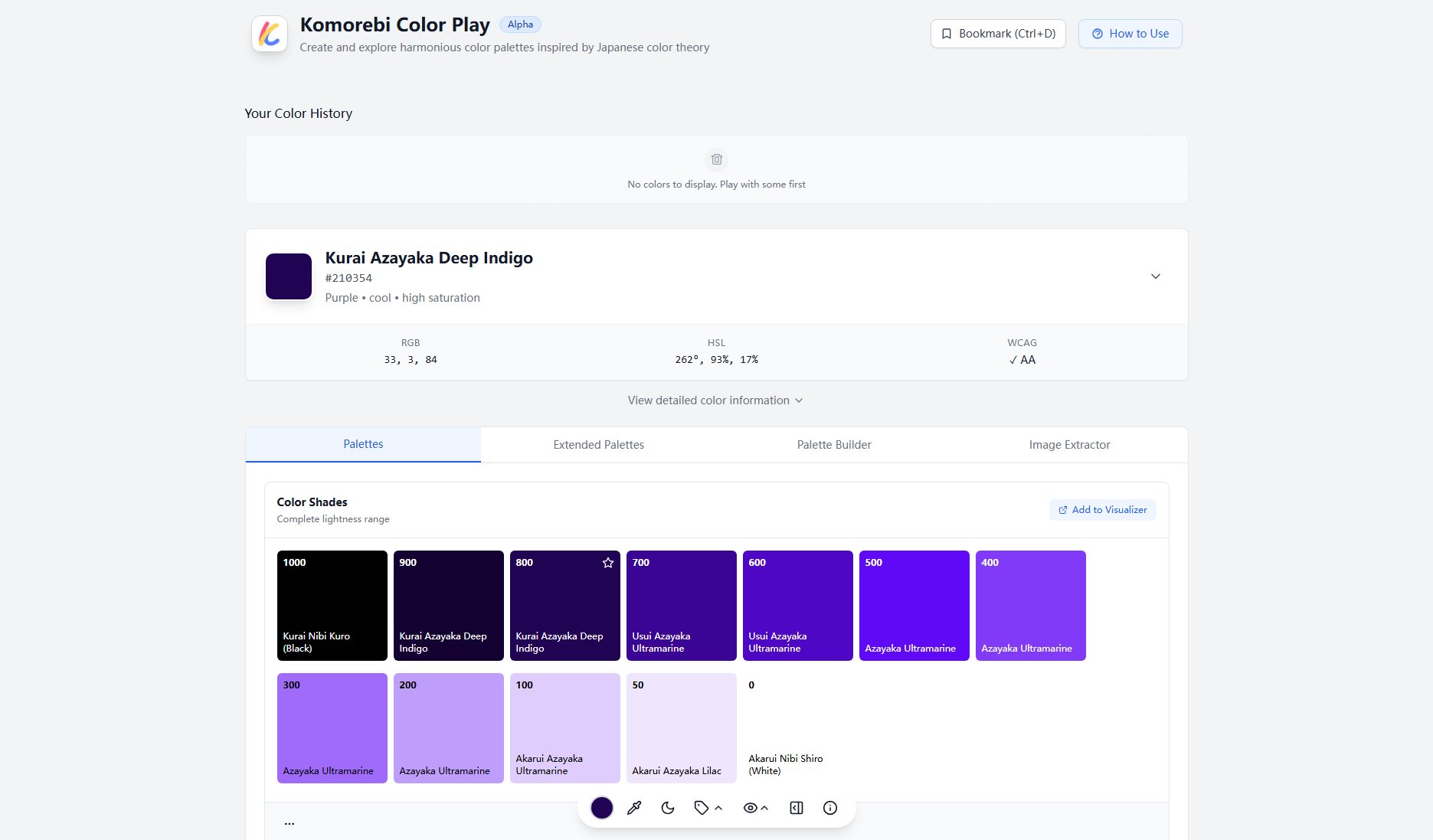
Komorebi Color Play Interface & Screenshots

Komorebi Color Play Official screenshot of the tool interface
What Can Komorebi Color Play Do? Key Features
Comprehensive Color Standards
Displays color values across 12+ industry standards including PANTONE, RAL, NCS, Federal Standard, and automotive colors. This cross-industry compatibility makes it invaluable for designers working on projects that require precise color matching across different materials and mediums.
Advanced Palette Generation
Automatically creates 6 types of harmonious palettes (monochromatic, analogous, complementary, triad, tetrad, split-complementary) with Japanese-inspired color naming. Each palette maintains visual harmony while offering creative variations for design projects.
Accessibility Analysis
Provides immediate WCAG compliance ratings against both white and black backgrounds, suggesting accessible alternatives when colors don't meet contrast requirements. This feature is crucial for creating inclusive designs that comply with accessibility standards.
Scientific Color Data
Includes technical measurements like LAB values, OKLCH, luminance, and wavelength for users who need precise color science data. These metrics are particularly valuable for digital product designers and developers working with color systems.
Material Design Integration
Offers direct compatibility with Material Design and Tailwind CSS color systems, making it especially useful for UI/UX designers and frontend developers working with these frameworks.
Best Komorebi Color Play Use Cases & Applications
Brand Identity Development
Designers creating brand identities can use Komorebi to develop cohesive color systems that work across print and digital media, ensuring consistency in PANTONE for print and HEX/RGB for digital applications.
Accessible Web Design
Web developers can quickly verify color contrast ratios and find accessible alternatives when their primary color choices don't meet WCAG standards, reducing accessibility compliance issues.
Product Design
Industrial designers can match colors across different materials by referencing RAL, automotive, and Federal Standard values, ensuring color consistency in physical products.
How to Use Komorebi Color Play: Step-by-Step Guide
Start by selecting a base color using the color picker or by entering a specific color code (HEX, RGB, or HSL). The tool will immediately display all color information and accessibility ratings.
Explore the 'Palettes' section to generate harmonious color schemes. Choose from different palette types (monochromatic, analogous, etc.) and see how colors work together visually.
Check the accessibility ratings under 'Accessibility & Impact' to ensure your color choices meet WCAG standards. Use the suggested accessible alternatives if needed.
Copy any color values or palettes you want to use in your project. The tool provides values in all major formats for easy implementation in design software or code.
Use the 'Add to Visualizer' feature to save and compare different color combinations in your personal color history for future reference.
Komorebi Color Play Pros and Cons: Honest Review
Pros
Considerations
Is Komorebi Color Play Worth It? FAQ & Reviews
Komorebi stands out with its Japanese-inspired color naming, extensive industry standard support, and unique accessibility features that go beyond basic contrast checking.
Yes, all color values and palettes generated can be used freely in commercial projects without attribution.
Conversions are based on widely-accepted industry formulas, but for critical applications, we recommend verifying with physical swatches due to screen calibration differences.
Yes, you can use the 'Add to Visualizer' feature to build and save custom palettes in your color history.