EvilCharts
Animated & Interactive charts for your next project
What is EvilCharts? Complete Overview
EvilCharts is a cutting-edge charting library designed to bring data visualization to life with beautiful animations and interactive features. It caters to developers and designers looking to enhance their projects with dynamic, visually appealing charts. The tool solves the common pain points of static and uninspiring data presentations by offering a variety of animated chart styles that engage users and make data more digestible. EvilCharts is ideal for web developers, data analysts, and UI/UX designers who want to create standout visualizations without compromising on performance or ease of integration. With a focus on both aesthetics and functionality, EvilCharts provides a seamless way to transform raw data into compelling visual stories.
EvilCharts Interface & Screenshots

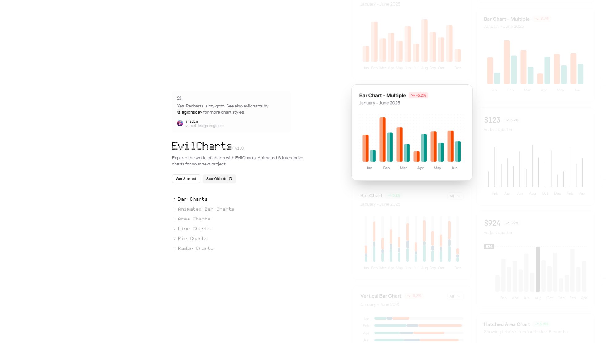
EvilCharts Official screenshot of the tool interface
What Can EvilCharts Do? Key Features
Animated Bar Charts
EvilCharts offers a range of animated bar charts that bring data to life. These charts include vertical and horizontal variants, as well as multi-series options. The animations are smooth and customizable, allowing developers to control the speed and style of transitions to match their project's aesthetic.
Interactive Area Charts
The area charts in EvilCharts are not only visually striking but also interactive. Users can hover over data points to see detailed information, making it easier to understand complex datasets. Variants include hatched, highlighted, and rounded area charts.
Dynamic Line Charts
Line charts in EvilCharts come with various styles such as dotted, multi-line, and glowing effects. These charts are perfect for showing trends over time, with animations that draw the viewer's attention to key data points.
Pie and Radar Charts
EvilCharts includes pie and radar charts that are both functional and visually appealing. The pie charts feature size variations and glowing effects, while radar charts provide a unique way to compare multiple data sets in a circular layout.
Customizable Animations
All charts in EvilCharts come with customizable animations. Developers can adjust the duration, easing functions, and even trigger animations based on user interactions, ensuring a seamless and engaging user experience.
Best EvilCharts Use Cases & Applications
Business Dashboards
EvilCharts is perfect for creating dynamic business dashboards. The animated and interactive charts help stakeholders quickly grasp key metrics and trends, making data-driven decision-making more intuitive.
Financial Reporting
Financial data can be complex, but EvilCharts simplifies it with visually appealing line and bar charts. The animations highlight changes over time, making it easier to spot trends and anomalies.
Marketing Analytics
Marketers can use EvilCharts to visualize campaign performance. The radar and pie charts are particularly useful for comparing multiple metrics and showing distribution of data.
How to Use EvilCharts: Step-by-Step Guide
Install EvilCharts via the GitHub repository by cloning or downloading the library. Ensure you have the necessary dependencies installed in your project.
Import the desired chart components from the EvilCharts library into your project. The library is modular, so you only need to import what you use.
Prepare your data in the required format. EvilCharts supports standard data structures, making it easy to integrate with existing datasets.
Configure your chart by setting properties such as animation duration, colors, and interactivity options. The library provides extensive documentation to guide you through customization.
Render the chart in your application. EvilCharts is designed to work seamlessly with modern web frameworks, ensuring smooth integration and performance.
EvilCharts Pros and Cons: Honest Review
Pros
Considerations
Is EvilCharts Worth It? FAQ & Reviews
EvilCharts offers a free plan with basic chart types and limited customization. For advanced features, you can upgrade to the Pro or Enterprise plans.
EvilCharts is designed to work with modern web frameworks such as React, Vue, and Angular. It is also compatible with vanilla JavaScript projects.
Yes, EvilCharts allows you to customize animations by adjusting duration, easing functions, and triggers. This ensures the charts fit seamlessly into your project's design.
Yes, EvilCharts provides comprehensive documentation to help you get started and make the most of its features. The documentation includes examples and API references.
Support is available through the community for free users. Pro and Enterprise users receive priority and dedicated support, respectively.